Bringing Pantone’s Colour of the Year ‘Classic Blue’ into your décor
We’re excited to announce that PANTONE has released their 2020 Colour of the Year!
Every year we wait with bated breath for the colour experts at PANTONE to announce the ‘Colour of the Year’, which goes on to inspire fashion runways and interior designers across the globe.
Last year’s Colour of the Year, Living Coral, was vibrant and injected a bright and powerful energy into our interiors, whereas this year’s colour exudes cool, calm tones and is elegant and simple.
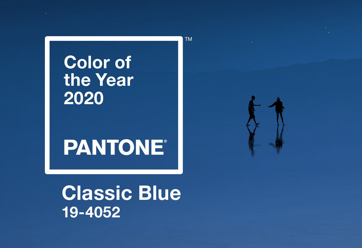
Introducing PANTONE 19-4502 Classic Blue!
Classic Blue is regal. It’s calm, yet strong and confident, the deep blue hue of blueberries.
What does PANTONE have to say about Classic Blue?
Pantone describes Classic Blue as “suggestive of the sky at dusk, the reassuring qualities of the thought-provoking Classic Blue highlight our desire for a dependable and stable foundation on which to build as we cross the threshold into a new era”.
How to bring Classic Blue into your décor
Make a statement with this year’s PANTONE Colour of the Year by incorporating it into your décor. A Classic Blue vase, a rug with Classic Blue accents or in the bedroom a throw that contrasts against your crisp white sheets. Why not bring Classic Blue into your outdoor area with throw cushions on your outdoor furniture, table accessories or even a pot plant.
To help you incorporate Classic Blue into your property’s décor, PANTONE also released a range of complementary colour palettes, all reflecting differing moods and colour combinations. Here are our favourite three.
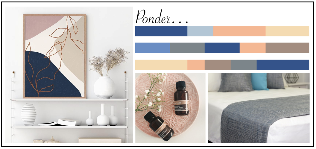 PONDER
The natural earthy tones of Ponder perfectly complement the rich tones of Classic Blue. Ponder is soft and warm, a calming surround for this year’s PANTONE Colour of the Year.
Incorporate this palette into your bathroom décor with our Natural Earth or eco.logic* guest amenity ranges. Or, bring it into the bedroom with our Camel Thermalux or Walnut Coral Fleece Blankets or the Silver Bed Runners and Cushions.
If you’re ready to redecorate your living room, add the warm tones of Ponder with the Garden Party or Magnifica artwork. Then, add a splash of Classic Blue with a lampshade, vase or a bunch of freshly picked flowers.
SNORKEL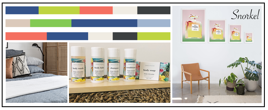
Like its name suggests, this palette is colourful like a tropical reef. The brightness is balanced with black and white and works as a great contrast alongside Classic Blue.
When we think tropical we instantly think of our Makai Spa or Pacifics Pina Colada collection of bathroom amenities. They’ll sit perfectly next to Classic Blue towels or other bathroom accessories.
If you’re looking for artwork our Coco Yellow and Montana Posters encapsulate the colours of the Snorkel palette superbly.
When the weather starts to cool down and you’re getting ready for winter, our Charcoal Blankets and Cotton Waffle Blankets will sit pretty next to splashes of Classic Blue in the form of throw cushions or a vase on your bedside table.
DESERT TWILIGHT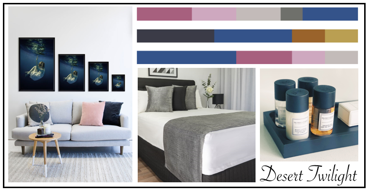
The colours in the Desert Twilight palette take inspiration from the early evening sky. Elegant and dripping with luxury, this palette allows Classic Blue to glow.
For us, styling with the Desert Twilight palette is all about luxury, with our Silver Thermalux Blankets and Oak Bed Runners and Cushions. These colours pair brilliantly with Classic Blue, bringing depth and elegance to your room.
In the bathroom add a touch of luxury with our eco.logic* or London Collection range of bathroom amenities, or in the bedroom and living areas bring in the colours of this palette with the Peonies or Child of the Sea prints.
There are so many ways you can incorporate Classic Blue into your décor and we can’t wait to see how it pops up in properties across Australia. To find out more about our range of hotel amenities, email info@nationalhotelsupplies.com.au


