Styling with this year’s ‘Pantone Colour of the Year’
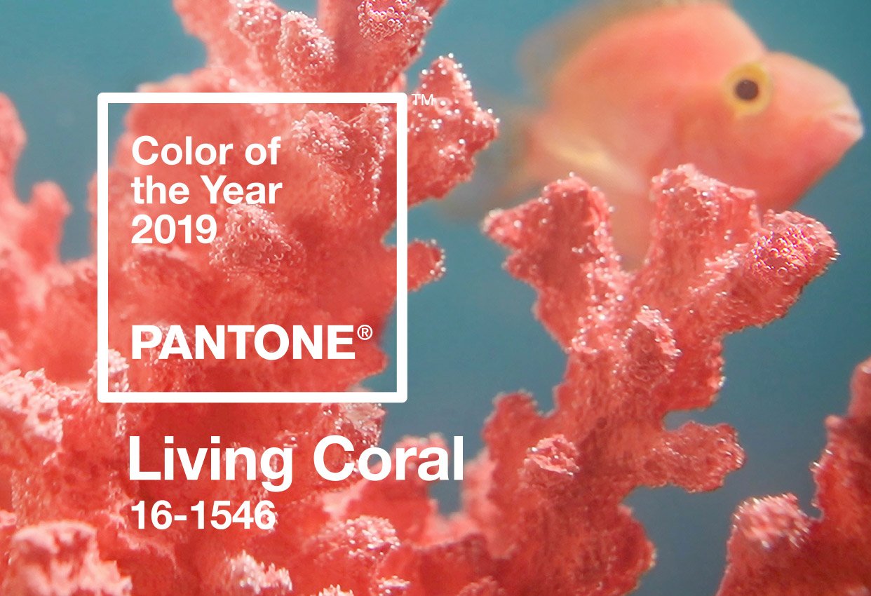
Every year the talented team of colour specialists at PANTONE release their ‘Colour of the Year’, and this year they’ve chosen the vibrant and bright ‘Living Coral’.
PANTONE describe Living Coral as ‘an animating and life-affirming coral hue with a golden undertone that energizes and enlivens with a softer edge”.
Living Coral is eye-catching and refreshing and has us dreaming of the vivid colours of the Great Barrier Reef. It’s safe to say, we’re a fan!
How did PANTONE choose this colour? The PANTONE Color Institute has positioned itself as an ‘authority on colour’, and every year they take on a global search through all aspects of life to name their ‘Colour of the Year’. They say it is “a colour snapshot of what we see taking place in our global culture and serves as an expression of a mood and an attitude”.
*What PANTONE have to say about Living Coral? *Leatrice Eiseman, Executive Director of the Pantone Color Institute, says that “Colour is an equalizing lens through which we experience our natural and digital realities and this is particularly true for Living Coral. With consumers having human interaction and social connection, the humanizing and heartening qualities displayed by the convivial PANTONE Living Coral hit a responsive chord”.
How do you incorporate Living Coral into your property’s décor? Inject the bright and powerful energy of Living Coral into your space with a lampshade or cushions scattered across your daybed. Incorporate it into your kitchen in the guise of a decorative vase or some flowers, and match it with a fabulous piece of artwork on the wall.
Bring Living Coral into your living areas with candles, or even pot plants. Living Coral looks beautiful against crisp white hotel sheets, or in artwork hung on a freshly painted white wall.
What colours complement Living Coral? As per normal, PANTONE have released a spectacular series of colour palettes as inspiration, so you can put together the ideal combination of hues. 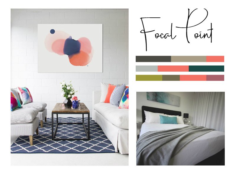
This year our favourite palettes are ‘Focal Point’, ‘Under the Sea’ and ‘Sympatico’.
‘Focal Point’ is a modest and cool palette that allows Living Coral to really pop and be the hero beside all the other shades. Our Grapefruit artwork or our soft Herringbone Throw draped across your couch or bed work great beside Living Coral, ensuring the colour of the year is a standout.
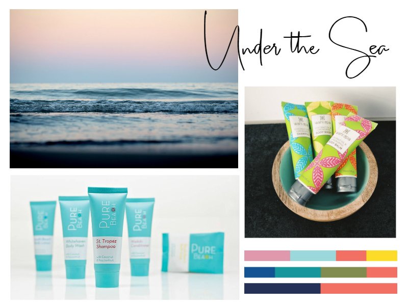
The colours in the ‘Under the Sea’ palette draw inspiration from our underwater ecosystems. If you’re working with this collection of hues our bright and vibrant Wahi Spa or Pure Beach range of guest amenities are a perfect choice, as is our Rainbow Bay and Crimson Plume Dusk artwork.
Our third choice of palettes is ‘Sympatico’, described by PANTONE as “a beautiful array of colours that humanize; fusing together a panoply of international skin tones”. This palette is soft and warm, blending sweetly with Living Coral. If you’re adding Living Coral to your bathroom our Natural Earth range of boutique amenities is a great match, and the Currumbin artwork, or Super Luxe Blanket show off the colours of Sympatico and will work great in your living room or bedroom.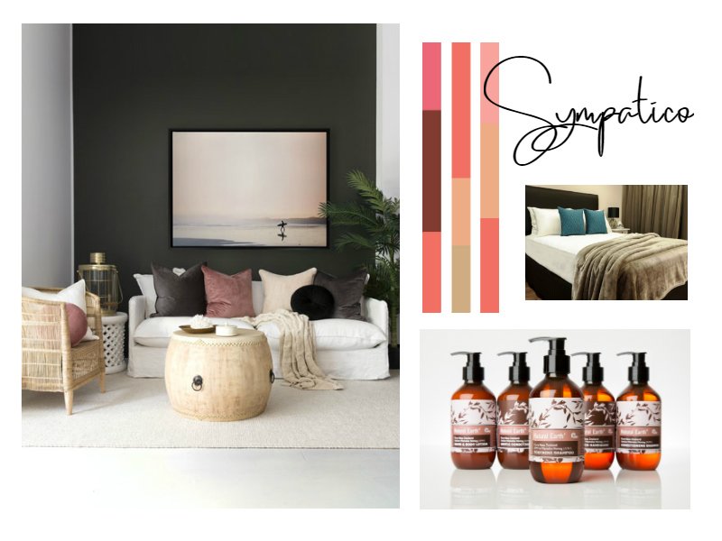
If you’re adding a pop of Living Coral to the bathroom the Pacifics Pina Colada collection also works a treat beside this bright, vibrant colour.
We’re so excited to see how Living Coral will be used in interior design throughout the year, if you decide to incorporate it into your property don’t forget to send us a photo!


